
Type History presentation
Gotham Typeface
Gotham Typeface was created the year 2000 by a an called Tobias Frere-Jones August 28, 1970 (age 49)
The Purpose of the font was created because of its sans-serif modernism and sans-serif look this was commissioned by GQ Magazine, It was inspired by a new York bus terminal, the over all communication from the font the magazine wanted the text to look masculine, and new while being fresh.
The characteristics of the Text is that it is reasonably high o the X axis as-well as wide apertures(Effecting the Bowl within the letters A, B, D, O, P, Q, R, a, b, d, e, g, o, p, and q.)
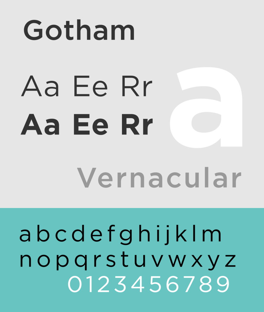
The font is also sans-serif featuring no Slabs.
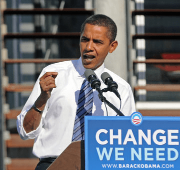
Since its small inception on the cover on he magazine it has gained popularity within the American nation as it was used in Obama 2008 presidential campaign. As well being used for the newly build World trade centre Logo in new york as well as the 9/11 memorial site. This shows the typeface also having a palatial impact on Americans as an impactful font.

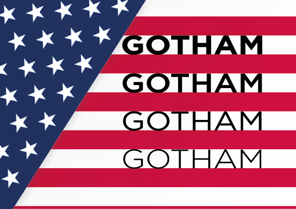
Websites platforms have also started using the font such as twitter On 30 May 2014 and Netflix in 2018, while also ABS-CBN corparation started to use the typeface On 1 January 2014.
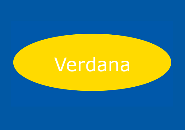
Verdana Typeface
Verdana Typeface Was created in 1996 by Matthew Carter who was born on born 1 October 1937.
The Purpose of the creation of this font as it was commissioned by Steve Ballmer chief offerer of Microsoft, This typeface was designed for low-resolution computer screens of the current time.
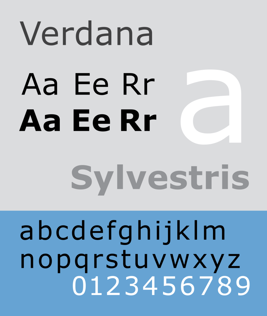
Verdana has uses large x-height this with designs like Helvetica with tight spaces between catch later(known as churning), because of the tight spacing the text has about of vertical presences when it is placed on the page.
The usage of this font was mostly interrogated into the windows operating system this was feature on windows xp and windows 98. as well as being transfused over to mac OS and linx. The usage of the font now a days are used for the garden and IKEA signs within stores.
presentation:
https://docs.google.com/presentation/d/1eGWVOZNRNQ9FNyoP2TmIu1thGmkJ3T6UtDnu-pxv8E4/edit?usp=sharing
Research and development
For the current Brief the text needs to be more dramatic to get the message across.

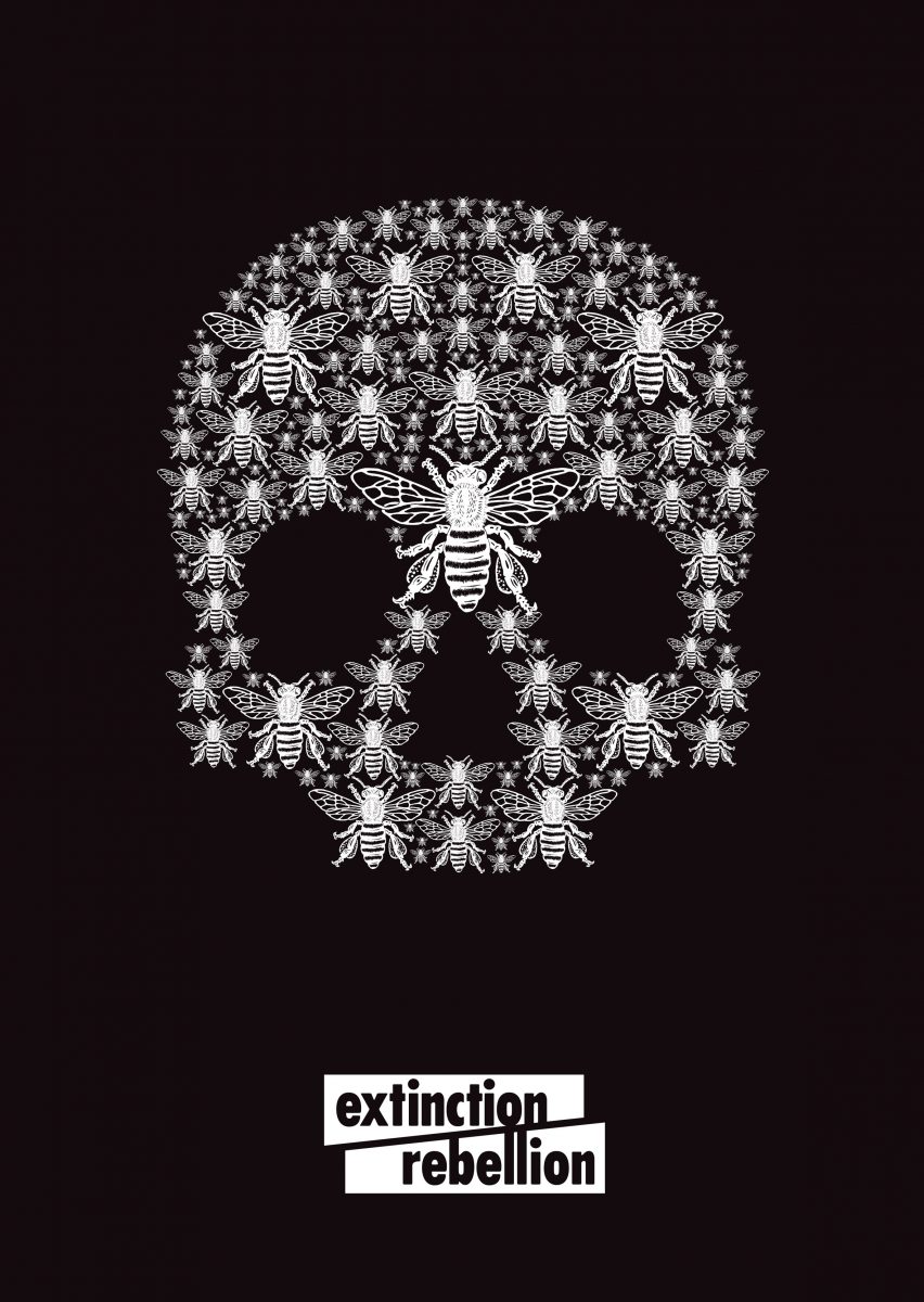
The idea of having the skull incorporated into a tree or the other way round symbolises our connection to trees and how we are bound to them, the skull representing that if all trees die then we will cease to exist. This would make a dramatic image and it’s meant to catch your eye. I want to go for a shock approach as I think this will generate more discussion around the poster and around the problem that the poster is trying to communicate.


The use of bold and capital letters shouts at you which is good to get attention and can be viewed from long distances. Not all of the letters are solid black, which makes it look like it’s been printed at home where they are running out of ink. This suits Extinction Rebellion because it creates a feeling of urgency and emphasises that it is a young organisation who don’t have much money.

This gives me another idea of the earth melting in an ice cream cone, like it was ice-cream. This makes us think of global warming.
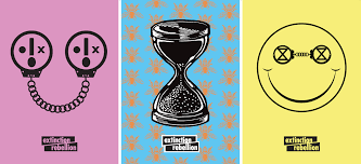
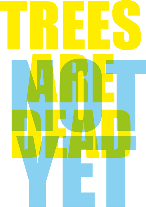
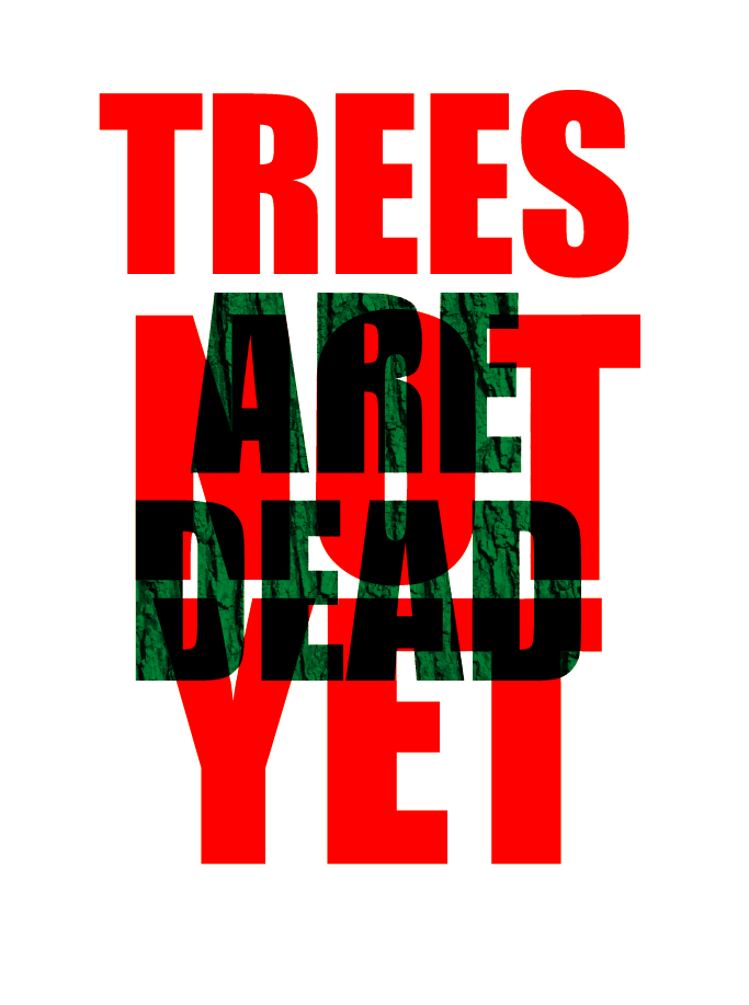
The letters are all capitals and well spaced as if it was typed. It gives an 80s vibe and reminds me of public notices.

The image above gives the same message of the earth melting, but the text is also melting and the whole poster is moving downwards. I think it is more effective because it is drawn by a child and makes me wonder if there will be a future for children. The typeface is also distorted, shaking and dripping down and melting with the poster. Your eyes focus on the red first as it is the colour used for danger and then you realise that the blue and green represent the earth.


Fact Report Climate crisis: how to make space for 2 billion trees on a crowded island like the UK
https://theconversation.com/climate-crisis-how-to-make-space-for-2-billion-trees-on-a-crowded-island-like-the-uk-128098
This is an organisation that helps planting trees and making space for trees to be planted on an island that is being over crowded which co asiseds with rewild.
https://theconversation.com/rewild-25-of-the-uk-for-less-climate-change-more-wildlife-and-a-life-lived-closer-to-nature-123836
Re-wild is a organisation that seeks to reclaim land for nature to grow like planet life and wildlife throughout the UK so nature can grow and combat global warning.
https://thedieline.com/blog/2018/2/22/good-things-come-in-small-packages
Dieline is a seed packaging distributor That have good designs relating what plant that would be distributed on the cover.
Typography
To Do:
Stage 1 Research
A3 workbook showing ideas and layouts for different kinds of typography (sketches and
notes)
Carry on working on blog
Stage 2 Design development
Development sheet of ideas; which ones will/won’t work and why
Stage 3 Preparation
Create folder
Stage 4 presentation
5 minute presentation on topic
Design report 1000-1500
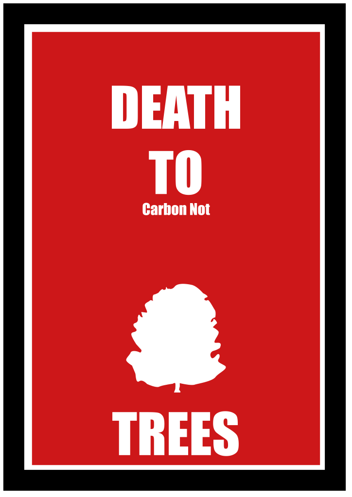
When I first read the brief it was the time of the Australian fires and I was looking at those. I took
inspiration from the images that were on the TV and in the papers at the time; this is why I went for
the red colour with the silhouette of the tree. I wanted the typography to look like a fire hazard
poster, so I used a similar typeface in capitals, which would remind people of a warning poster.
For the screen printing, my initial idea was to create a message about trees, because this was part of
a website conversation where I read about trees being chopped down. I think trees are important,
especially to combat climate change and this is why I chose them. The first slogan I came up with
was Death to Trees, because it was the opposite of what everyone else was doing, such as the
Extinction Rebellion posters encouraging us to save resources. I thought it would have good shock
value, be more attention grabbing to have a seemingly negative message. I drew out my idea and
digitalised it, planning to make a screen print from it.
I placed a white silhouette of a tree on a red background at the bottom of the image. I wanted big
and bold type to grab people’s attention at a distance. I placed the type DEATH TO TREES in red
capitals across the image of the tree. People associate red with danger.
I was aiming my slogan at as many people as possible, which was why I kept it to a simple design. I
wanted it to be seen from a distance to pull viewers in to be able to read the context when they get
closer.
I changed my idea when I realised that it wasn’t really conveying the message I wanted to get across.
After discussion with my tutor, I added in words to create the new slogan; DEATH TO FOSSIL FUEL TO
HELP TREES, using black ink apart from DEATH TO TREES, which was still printed in red. This kept my
original slogan but conveyed the message better, adding more context and communication to the
viewer.
My typo plan was ready when we went to Letterpress Printing for the practical workshop. I was able
to catch up quickly, as I had missed the first day. I chose blocks as close as possible to my original
design and laid them on the grids, although I had to get some help with getting the woodblocks in
the right direction. I carefully rolled black or red ink on the letters according to my design and
printed the image using the press. It came out well the first time and I was pleased with the way it
looked. If I had had more time I could have printed the lettering on top of the image of the tree but
the sizes of the lettering and the tree were not compatible so I wasn’t able to do this. However, I was
pleased with the final image, even without the tree; it was satisfying and nice to be able to produce
multiple copies of the same thing. I was surprised how therapeutic it was; calming and
straightforward.
If I had the chance to repeat the printing workshop, I would experiment with different colours,
maybe green and black to link in with climate change posters which are usually green. This might
have helped the communication more instead of red.
Putting the design on the acetate for screen printing was not easy; the tape had to be very precise to
pass through the printer, but it kept jamming which was frustrating. I stayed with the same design as
I had for the letterpress, but I needed two layers for each separate colour. I was able to line up the
two pieces of acetate to achieve good registration. I liked the resulting prints.
The screen printing was a longer process to achieve the same results, although it gave a sharper
result. I preferred the letterpress method because it was more hands on, but once you have set up
your letters you are good to go. With the screen printing, if you flood the screen with ink then you
have to start again, clean and dry the screen and wait for it to be ready.
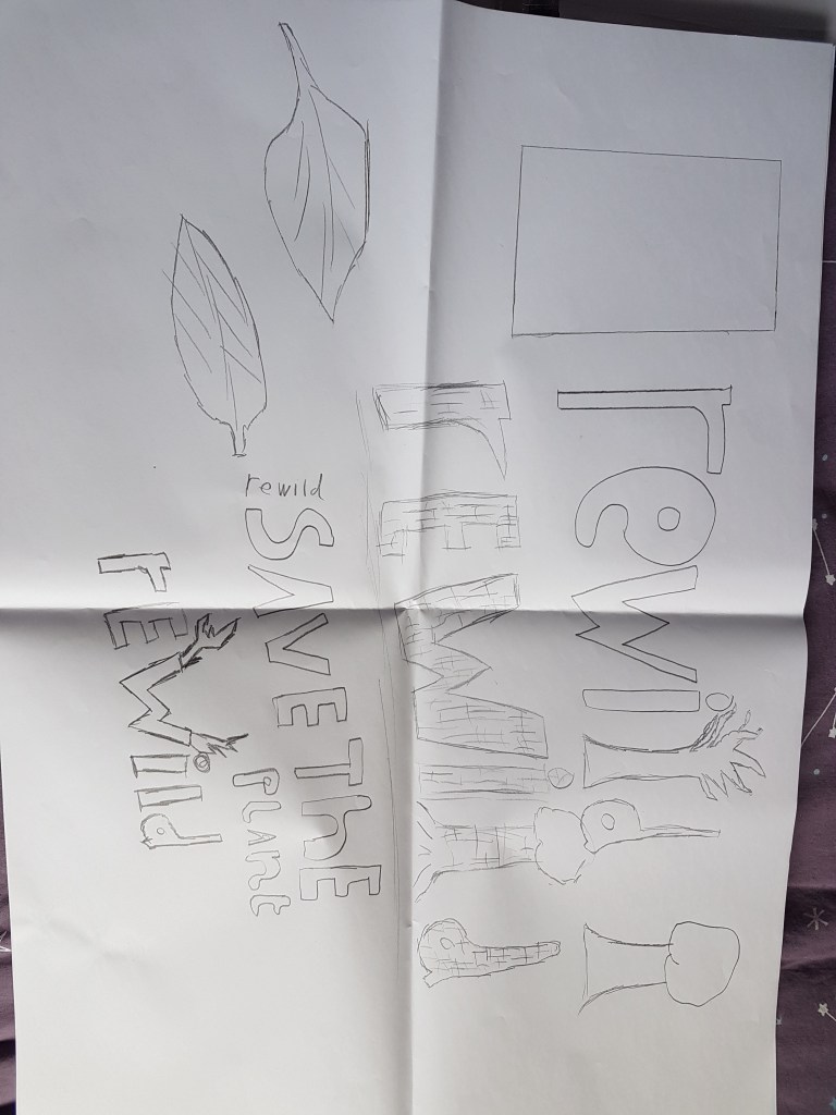
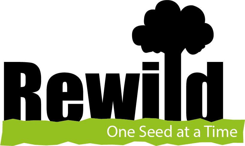
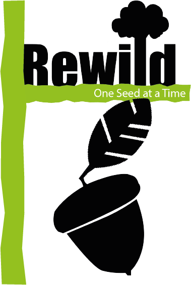
For my seed packet, I read an article on rewinding and I wanted to integrate this with a seed packet
for trees, such as apple, pear, sycamore or oak. I am designing the seed packet and reworking the
title for appropriate marketing aimed at the age group teens to young adults. This is a good time to
encourage this age group to plant seeds because there is a media focus on global warming and the
message that trees are a way to tackle global warming is widespread, especially among this age
group.
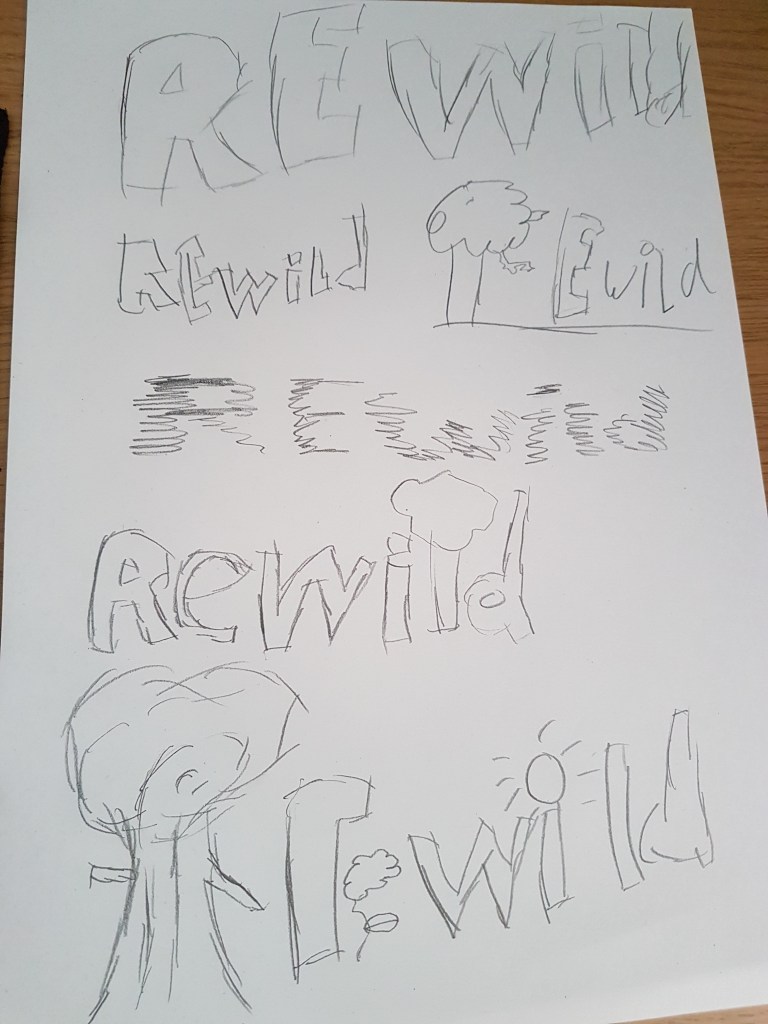
Since this unit is a type-driven brief I started by looking at the type and how it will be laid out on the
page. My first design choice was to replace the letter L with the image of a tree.


Leave a comment